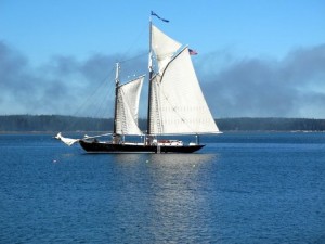
Travel websites should seek to flow like this Maine Windjammer in Penobscot Bay, seamlessly and effortlessly. Photo by Clark Norton
I recently read a statistic that unless a website loads within six seconds, the majority of users will give up and go elsewhere. Whether completely true or not, it speaks of our collective impatience when we can’t have our way instantaneously on the Internet.
My frustrations with websites — and travel websites, in particular, since I spend so much time on them — come when I can’t find what I’m looking for after not just six seconds, but sometimes minutes and what seems like hours. Or I never find what I’m looking for at all after exhausting every possible avenue I can think of.
How tough can it be to make it easy for your potential visitors or customers (depending upon whether or not you’re marketing a destination or travel-related business) to find, say, a list of upcoming events in the region you’re promoting, or the parking policies at your hotel, or as simple a thing as the itinerary for a cruise you’re interested in taking?
Apparently it can be very difficult, because these are all things I’ve tried to find recently, and been thwarted or delayed each time by websites that seem to have been designed for mind-readers or robots rather than normal human beings.
One thing I hear a lot from other baby boomers is frustration over websites that aren’t intuitive and that seem to set up barriers to finding what they’re looking for, rather than guiding them quickly and easily to the most basic information.
The latter is what I call “flow.” And it could very possibly make the difference between landing or losing a visitor or customer when they go to your website.
In a previous post, I called attention to a state’s official tourism website that had been lauded for its special seasonal website that had to accessed from the main site. The problem was that the links from the main site were almost impossible to find — even if you went there looking for them, as I did. One link even led to the wrong season. (And as a sidenote, harking back to yesterday’s post about keeping your website up to date, when I just now checked the “Spring” seasonal site, it was promoting an event that took place in April — of 2013. This is website 101, folks. If you don’t know the dates of an upcoming event yet, don’t list last year’s.)
Since I write a lot about cruising, I spend a lot of time — often too much time — on sites that don’t “flow.” I’m not sure why cruise lines’ websites in particular are often so confusing, but sometimes finding the simplest information about a prospective cruise can seem like dragging the truth out of a politician caught with his hand in the cookie jar. What are they hiding, and why?
The best cruise websites allow you to get to the information you need by any of several clearly marked channels or tabs: Destination (Alaska, Caribbean, Baltic, etc); Season or more specific dates; Ship (if the line has more than one); Departure port; and Length of the cruise.
Price is another possibility, if the cruise line sticks close to its brochure prices, but most don’t, so that category may be too variable. But a box leading to “Special Values” will draw attention, as will a box featuring “Family Cruises” (if applicable), “Theme Cruises” (if applicable), or other specialty cruises.
You shouldn’t have to navigate through three or more pages to find your cruise as though you were steering through rocky shoals in the dead of night.
Flow: if anyone should understand the concept, cruise lines should — but they too often fail the test.
In the next part of this series on travel websites, we’ll look at the best ways to use photography to capture — and captivate — your audience.
Meanwhile, be sure to download my free report, “How to Ride the Coming Wave of Boomers,” available here. It’s all about the best ways to market travel to baby boomers — the biggest-spending group of travelers the world has ever seen. It’s also the easiest way to subscribe to my blog, so you won’t miss a posting. Thanks!









2 Responses to Why “Flow” Is Crucial for Travel Websites